
We have seen the same pattern many times. A team wants better revenue visibility, so it exports data from HubSpot, updates a spreadsheet, fixes broken filters, and sends a report that is already old by the time leadership reads it. The problem is not effort. The problem is design.
An automated revenue dashboard in HubSpot turns sales and revenue data into a live decision system, not just a weekly report.
When we work on revenue analytics at ZenitData.com, we usually start with one simple question: what decision should this dashboard help us make today? That question changes everything. It stops teams from tracking every metric they can find and pushes them to build a dashboard that helps with pipeline review, forecast calls, pricing checks, or board updates.
This matters because dashboards work best when they support action. Research on effective dashboards and better business outcomes shows a clear link between strong dashboarding, higher accountability, and better commercial performance. We think that is exactly why revenue dashboards deserve more care than a standard report.
Start with the revenue questions
Before we open HubSpot, we need to define the business questions. This is where many dashboards fail. They begin with charts, not with decisions.
In our experience, the best automated revenue dashboards answer a small set of questions such as:
-
How much pipeline do we have by stage, source, segment, and owner?
-
Is current pipeline quality strong enough to support the target?
-
Where are deals slowing down, slipping, or dropping?
-
What is our win rate by segment, product, or lead source?
-
How accurate is our forecast compared with actual closed revenue?
If a metric does not help us act, it should not lead the dashboard.
One leadership team we supported had more than 30 charts in its first version. It looked serious. It also confused everyone. After one workshop, we cut it to eight charts tied to forecast risk, conversion, and sales cycle health. The dashboard became smaller and far more useful.
Less noise. Better calls.
Choose the right dashboard structure
HubSpot gives us flexibility, but structure still matters. We usually separate dashboards by audience, because a CRO, a sales manager, and a finance lead do not need the same view.
A practical setup often includes three layers.
-
An executive dashboard with bookings, forecast, pipeline coverage, and win rate.
-
A sales management dashboard with stage conversion, aging, rep activity, and slippage.
-
An operational dashboard with data quality flags, missing fields, lifecycle issues, and sync errors.
One dashboard should serve one main audience and one meeting rhythm.
That is why we avoid building a single dashboard for everyone. It sounds simple, but it usually creates clutter. At ZenitData.com, we prefer focused reporting logic that mirrors how teams already run forecast reviews and pipeline meetings.
Define the revenue metrics before building
Automation only works if metric definitions are stable. If sales counts pipeline one way and finance counts it another way, the dashboard will trigger debates instead of decisions.
Before building, we define each metric in plain language. For example, we decide:
-
What counts as pipeline?
-
Which deal stages are included in forecast categories?
-
Is revenue measured on created date, close date, or recognized date?
-
How do we treat churn, expansions, or multi-year deals?
This is also where custom properties become useful. HubSpot lets us create fields for forecast category, deal health, pricing model, region, or lead source grouping. Those fields turn raw CRM records into a real reporting model.
We often point teams to our guide on revenue analytics because strong definitions are the base of every good dashboard, whether the reporting lives in HubSpot or in a wider data stack.
Clean the data before automating
Here is the part people want to skip. We understand why. Cleaning CRM data is not exciting. But poor data breaks trust fast.
Automation does not fix bad data. It only makes bad data move faster.
We recommend checking a few problem areas first:
-
Duplicate companies and contacts.
-
Deals without amount, close date, or owner.
-
Stages used in inconsistent ways.
-
Lead sources overwritten or left blank.
-
Products and line items missing from deals.
This work pays off. A dashboard is a trust product. Once leadership sees one number that feels wrong, confidence drops. In some cases, we set up a separate data quality dashboard first, then build the revenue dashboard after the records are stable.
The same idea shows up in public sector reporting too. The economic dashboard used by the City of Tampa pulls many indicators into a single view only because the data sources and definitions are managed with care.

Build the dashboard inside HubSpot
Once the logic is clear and the data is clean, we can build. HubSpot dashboards are flexible enough for most mid-market revenue use cases, especially when the CRM is well structured.
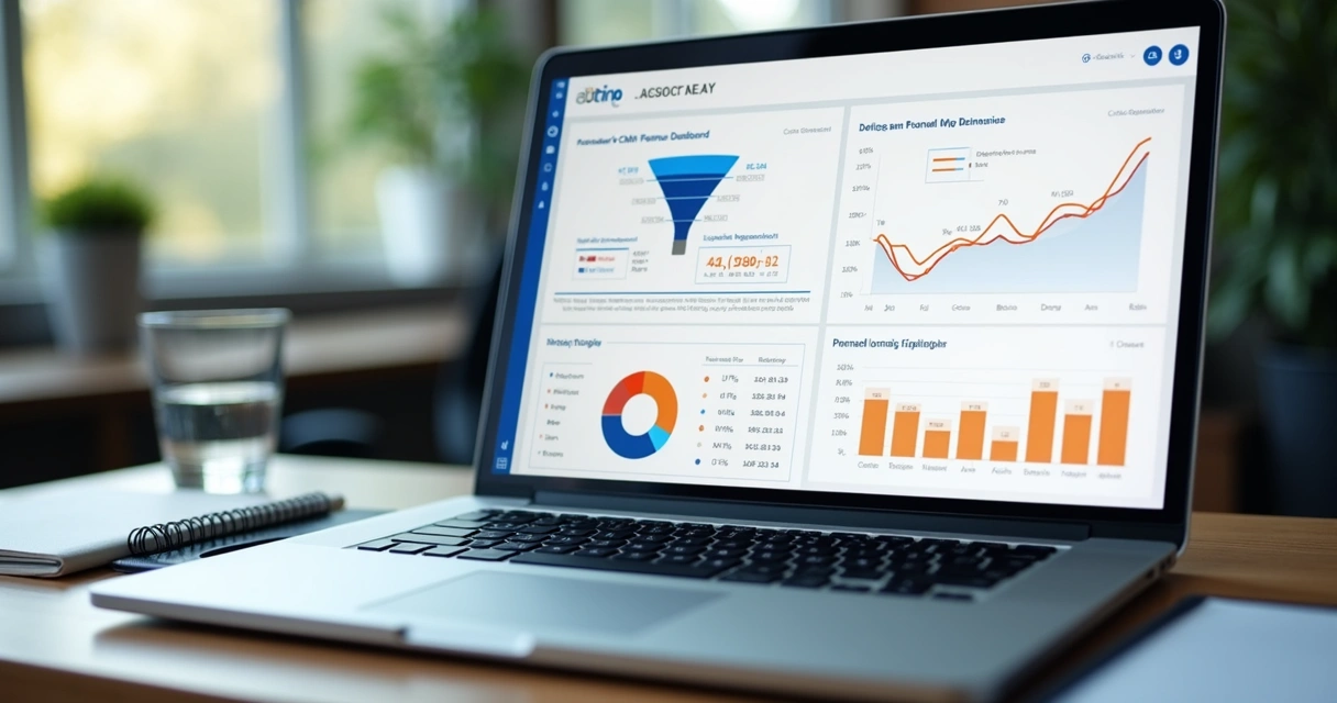
We usually start with these chart types:
-
Single number cards for monthly bookings, open pipeline, and weighted forecast.
-
Funnel reports for deal stage conversion.
-
Bar charts for pipeline by owner, segment, or source.
-
Line charts for revenue trends over time.
-
Tables for at-risk deals, slippage, and aging pipeline.
The best HubSpot revenue dashboards combine summary metrics with a short list of drill-down views.
That balance matters. If a dashboard only shows totals, we cannot find the reason behind change. If it only shows detail, leadership misses the signal. We want both.
For SaaS teams, this can extend into MRR, expansion, and funnel velocity. We have written about this reporting logic in our overview of the SaaS revenue dashboard, where recurring revenue teams need a tighter link between pipeline activity and financial outcomes.
Automate refresh, filters, and distribution
A dashboard becomes automated when the team no longer needs to rebuild it by hand. In HubSpot, that usually means three things: reports refresh from live data, filters are saved for each audience, and updates are distributed on a schedule.
We often create versions by region, team, or segment with shared logic and different filters. This keeps one reporting model in place while giving each team its own view.
Then we set email delivery for weekly pipeline reviews or monthly board prep. The point is not just convenience. It is consistency. People trust dashboards they see often and in the same format.
Universities handle planning dashboards in a similar way. The dashboards and metrics used by Emory University for transparency and planning show how repeatable reporting helps teams identify issues and support better strategic choices.
Go beyond HubSpot when needed
HubSpot is strong for CRM reporting, but some companies need broader revenue views. That happens when finance data, product usage, billing systems, or warehouse data need to sit next to CRM metrics.
In those cases, we keep HubSpot as the operating source for sales teams and connect it to a wider reporting layer. That setup helps when the business wants cohort views, margin analysis, account-level profitability, or more advanced forecasting.
HubSpot should be the working system for revenue teams, but not always the only reporting system.
If that sounds familiar, our piece on integrating HubSpot with BI reporting explains how teams can extend visibility while keeping reporting logic clean. We also support broader revenue analytics engagements when companies need a more joined-up model across GTM and finance.
For forecasting and planning, richer models can make a real difference. Work from NJIT on data analytics and predictive planning is a good reminder that historical dashboards are useful, but predictive views can help teams allocate time and budget with more confidence.
Connect sales, finance, and leadership views
One quiet problem in revenue reporting is that each team sees a different version of reality. Sales looks at pipeline. Finance looks at bookings and collections. Leadership looks at target attainment. None of those views are wrong, but they need to connect.
We try to map the dashboard flow from leading indicators to lagging outcomes. That means linking activity and conversion to pipeline creation, pipeline to forecast, and forecast to closed revenue. If there is a pricing shift or a drop in win rate, the dashboard should make that visible before the quarter closes.
We also find it useful to document how HubSpot data lines up with other CRM setups or migration histories. That is one reason our article on sales system alignment between Salesforce and HubSpot is often part of the conversation for teams rebuilding their reporting stack.
A revenue dashboard should connect early signals to final results, not treat them as separate stories.
Avoid the dashboard mistakes we see most often
Most dashboard problems are not technical. They come from unclear ownership, too many metrics, or weak adoption.
The common mistakes are easy to spot once we know what to watch:
-
Using too many charts on one screen.
-
Mixing pipeline, bookings, and revenue without clear definitions.
-
Reporting on activities that have no link to outcomes.
-
Building reports no one checks in live meetings.
-
Skipping data governance after launch.
We once saw a dashboard with a perfect visual layout and almost no adoption. The reason was simple. It did not match the weekly sales review. Managers still used their own notes. After we rebuilt the dashboard around the real meeting agenda, adoption changed within two weeks.
Dashboards must fit the meeting.
How we know a dashboard is working
A good automated revenue dashboard changes behavior. We can feel it in forecast calls. Fewer debates about numbers. Faster discussion about causes. Better follow-up on weak segments or stalled deals.
We usually look for signs like these:
-
Leadership uses the same dashboard every week.
-
Sales managers can spot risk by stage, owner, or source in minutes.
-
Forecast variance gets smaller over time.
-
Data quality issues are caught earlier.
The real output of a revenue dashboard is not the chart. It is the quality of the decision that follows.
Conclusion
Building automated revenue dashboards with HubSpot is not only about choosing widgets and filters. It starts with clear revenue questions, strong metric definitions, clean CRM data, and a structure that matches how teams actually make decisions. When those pieces are in place, HubSpot can become a reliable operating layer for pipeline visibility, forecast control, and revenue accountability.
We think the strongest dashboards are simple, trusted, and used in real meetings. They show what is happening, why it is happening, and where action is needed next. That is the standard we aim for in our work at ZenitData.com, where revenue analytics is meant to support high-stakes commercial decisions without forcing teams to build a large internal analytics function. If you want to build a dashboard that leadership will truly use, get to know ZenitData.com and see how our revenue analytics services can help turn HubSpot data into a clearer growth system.

Frequently asked questions
What is a revenue dashboard in HubSpot?
A revenue dashboard in HubSpot is a set of reports that tracks sales and revenue performance in one place. It usually includes pipeline value, deal stage movement, win rate, forecast, closed revenue, and trend views by rep, team, source, or segment. Its job is to give teams a live view of commercial performance so they can make faster decisions.
How to automate reports in HubSpot?
We automate reports in HubSpot by building reports from CRM properties, saving filters for each audience, adding them to dashboards, and scheduling recurring delivery by email. We also make sure the underlying data fields are clean and used in a consistent way. Without that step, automation will not be reliable.
Can I connect HubSpot to other tools?
Yes, HubSpot can connect to other tools when a company needs broader reporting across finance, product, billing, or a data warehouse. This is common when teams want a fuller revenue view than CRM data alone can provide. In practice, many companies keep HubSpot as the main sales system and send data into a wider reporting layer for board reporting or advanced modeling.
Is it worth it to build custom dashboards?
Yes, custom dashboards are often worth it because each business has its own sales process, deal stages, pricing model, and reporting needs. A standard dashboard may show activity, but a custom dashboard shows the metrics tied to your targets and review process. We think custom dashboards create more trust because the logic reflects how the company actually sells.
How much do automated dashboards cost?
The cost depends on scope. A basic HubSpot dashboard built on clean CRM data can be low cost if the fields and process already exist. A more advanced setup with custom properties, governance, leadership reporting, and data from other systems will cost more. The biggest cost driver is usually not the dashboard itself, but the work needed to make the data trustworthy.